2D plots
Put an XY chart on the page when you already have a calculation and want a curve: capacity against span, pressure drop against flow, utilisation against load case. On the Plots tab, the XY Charts group holds Line, Area, and Scatter. They are three views of one region type. You can switch between them later without rebinding anything. Bar sits in its own group and is a different region: horizontal bars driven by a dropdown list crossed with a variable. It is covered at the bottom of this page.

Place a chart
- Open the Plots tab and pick Line, Area, or Scatter.
- Click the page. The region appears with its Configure panel already open. The canvas stays hidden until you close the panel, so there is nothing to look at yet.
- Fill the top row. The three placeholders are Chart title, X axis, and Y axis.
- Bind the first series as Sweep, Data, or List. The next section covers all three.
- Click the gear, labelled Configure, to hide the panel and reveal the chart.
- Evaluate the sheet with Ctrl+Enter so Sweep and List series have numbers to draw.

What the Configure panel holds
The gear toggles Configure on and off. The panel and the chart never show at the same time. Inside it you get the title and axis-label fields on the first row, then one block per series. Each block starts with a colour swatch (Series colour), the Series name field that feeds the legend, the three mode buttons, and below them the fields belonging to whichever mode is active. + Add Series at the foot appends another block with its own colour, name, mode, and bindings. The ✕ (Remove) on a block appears once there is more than one series to remove.
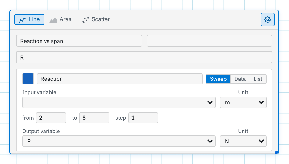
Bind a series: Sweep, Data, or List
The three mode buttons are Sweep (sweep an input variable), Data (enter data manually), and List (link to a worksheet variable). Polar charts use the same three, so this section is the reference for both.
Sweep — re-run the sheet across a range
Sweep mode steps an input through a range, re-evaluates the sheet at every step, and reads the output back. It is the same machinery as a sweep table, drawn as a curve instead of columns. Four fields control it:
- Input variable picks the name to vary, with a Unit dropdown beside it for the display unit. The unit list is disabled while the name carries no unit.
- from and to set the bounds. They start at 0 and 10.
- step sets the interval and must be greater than zero. It starts at 1.
- Output variable is the name read after each re-evaluation, again with its own display unit.
Both names must already exist above the plot. In a math region, a list, or a 2D Frame. The dropdowns are populated from what the sheet defines. A typical pair:
L := 6 m =
R := w * L / 2 =
Sweep the input L from 4 to 12 in steps of 0.5 and read the output
R, and you get the reaction plotted across every span in that
range.
Data — type the numbers
Two comma-separated lists, one for X values and one for
Y values, with placeholders 1, 2, 3, 4, 5 and
2, 4, 1, 5, 3. Give them the same length. If one runs longer, the
extra values are ignored. Use this for a handful of measured or reference
points that do not deserve worksheet names of their own.
List — bind two arrays
X variable and Y variable point at worksheet
names that already hold arrays, whether from linspace,
range, a matrix column, or a list you built in math. Only names
whose current value is an array appear in the dropdowns, which show
— none — until you choose. A hint under the fields prints the
dimensions and unit of each bound array, so a length mismatch between the two
is visible before you close the panel.
xs := linspace(0, 10, 50) =
ys := sin(xs) =
Add a second series
+ Add Series gives you another curve on the same axes. Two outputs against one sweep input, say, or a calculated curve over a set of test points. Each series keeps its own colour and its own legend name, taken from the Series name field. Drop the extras with ✕.
Line, Area, and Scatter
The tabs on the plot toolbar are Line, Area, and Scatter. Switching between them keeps every series binding intact. Area fills the region under the curve. Scatter draws markers and no connecting line. The tabs stay inside the XY family. They will not turn the region into a bar, polar, or 3D plot, which are separate insert commands from the ribbon.
Pin a value on the chart
Click a point on the chart to drop a value pin: a small callout carrying the series name and the coordinates. That is what you want when a reviewer asks for the number at mid-span rather than the shape of the whole curve. Click a pin to remove that one. To clear the lot, right-click the plot and choose Remove all pins. Pins are stored with the region, so they survive a reload, and they re-anchor after a resize or a re-evaluation as long as the data still contains the point they were dropped on.
Bar charts
Plots → Bar inserts a horizontal bar chart. Use it when your cases are discrete: load combinations, member sizes, wind directions, rather than a continuous range. It has no Line / Area / Scatter tabs. Configure asks for two things:
- Dropdown list selects a List region on the sheet. Every entry in that list becomes one bar, and the entry label becomes the category.
- Each series carries a colour, a name, and an Output variable: a scalar computed from the list's variables. Add a second series to compare two outputs side by side.
Order matters. The list goes above the formulas that consume it, and those formulas go above the bar chart. One point catches people out. Changing which entry the dropdown has selected does not change the bars. The chart runs its own sweep over every entry in the list, evaluates the output for each, and draws the full set regardless of what is currently selected on the sheet.